You can set up the device's screen display features such as screensaver to give users a better visual and operational experience.
Configure Screensaver
You can set the screen saver duration as well as the timing for the screen to be turned off for both screen protection and power reduction.
To set it up, go to the Device > LCD > Standby Interface Display interface.

Screensaver Time: Set the screen saver duration time(5 seconds to 2 hours).
Sleep: The time to start the screen saver mode(5 seconds to 30 minutes). For example, if it is set to 15 seconds, the device will go into screen saver mode when the device detects no operation or no approaching object for 15 consecutive seconds. When screen saver mode is disabled, the device screen will be turned off directly in 15 seconds.
Wakeup Mode:
Auto: The screen will be awakened when someone approaches without it being touched.
Manual: Users need to touch and wake up the screen.
Schedule: Select the schedule when the device will enter the automatic wakeup mode.
You can also set up the screen saver on Setting > Display&Sounds > Screensaver screen.

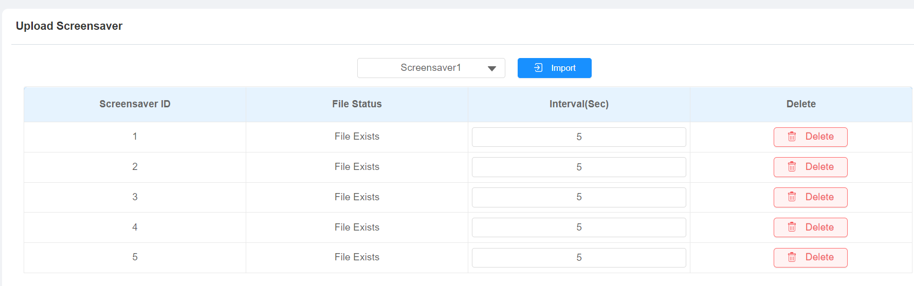
Upload Screensaver
You can upload screen-saver images individually or in batches to the device via the web interface, enhancing visual experience or serving publicity purposes.
Set it up on the web Device > LCD > Upload Screensaver interface.
Note
Uploaded images should be in JPG/PNG format with no more than 2M pixels.
The recommended resolution is 720x1280.
If the uploaded image duplicates an existing image ID, the existing image will be overwritten.
Home Screen Display
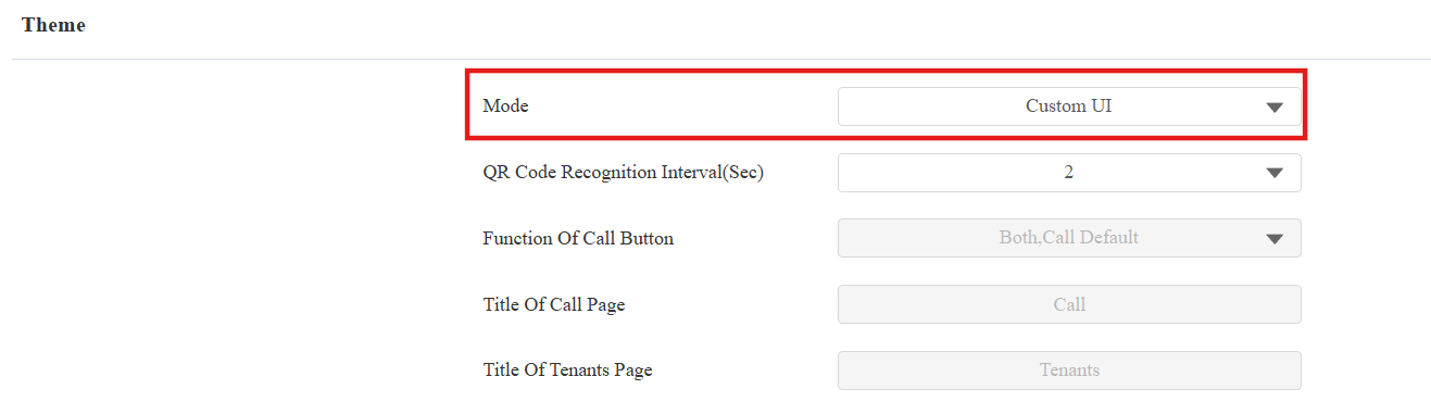
There are three home screen display modes: Default, QR code, Speed Dial, and Custom UI. To change the mode, go to Device > LCD > Theme interface.
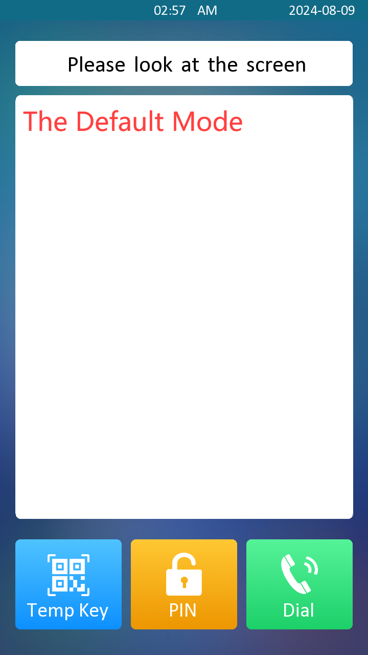

Default Mode:

Function of Call Button:
Both, Call Default: The Call button will be displayed on the home screen. Tap it to see and switch between the Call screen and the Tenants screen. The Call screen will be displayed first.
Both, Tenants Default: The Call button will be displayed on the home screen. Tap it to see and switch between the Call screen and the Tenants screen. The Tenants screen will be displayed first.
Only Call: The Call button will be displayed on the home screen. Tap it to see the Call screen.
Only Tenants: The Tenants button will be displayed on the home screen. Tap it to see the Tenants screen.
Title of Call Page: Customize the title shown on the upper area of the Call screen.
Title of Tenants Page: Customize the title shown on the upper area of the Tenants screen.
Display Type: Select the default display screen when waking up the device.
Name: Name the button to be displayed on the home screen.
Type: Select the button type. The button name will not change the button function.
Value: Set the value when Speed Dial is selected as the button type.
When the device is deployed on-premise, enter the local contact’s IP/SIP number.
When the device is deployed on the SmartPlus Cloud, it follows the cloud contact display rules and displays cloud contacts and devices.
QR Code Mode:

QR Code Recognition Interval(Sec): The scanning interval between each QR code(1-8 seconds).
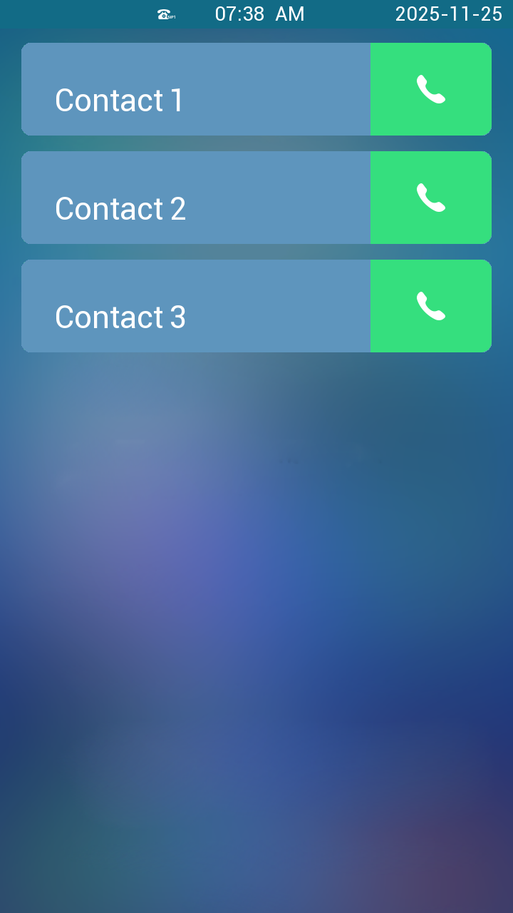
Speed Dial Mode:
Users can tap the specific tenant to call.
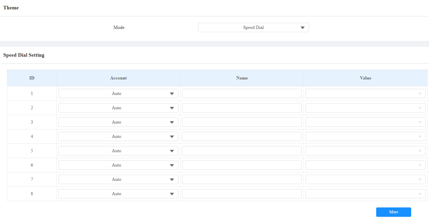
Account: Select the account to make the call.
Name: Name the contact.
Value:
When the device is deployed on-premise, enter the local contact’s IP/SIP number.
When the device is deployed on the SmartPlus Cloud, it follows the cloud contact display rules and displays cloud contacts and devices.
Custom UI
The Custom UI theme allows you to create a customized homepage on the device. You can select layout templates, configure button functions, upload custom background images and icons, and apply brand colors.
All changes are previewed in real-time before applying to the device.
Set it up on the Device > LCD interface. Set Theme to Custom UI.
Then, configure layout and buttons on the Key In Homepage Of The Custom UI Theme section.
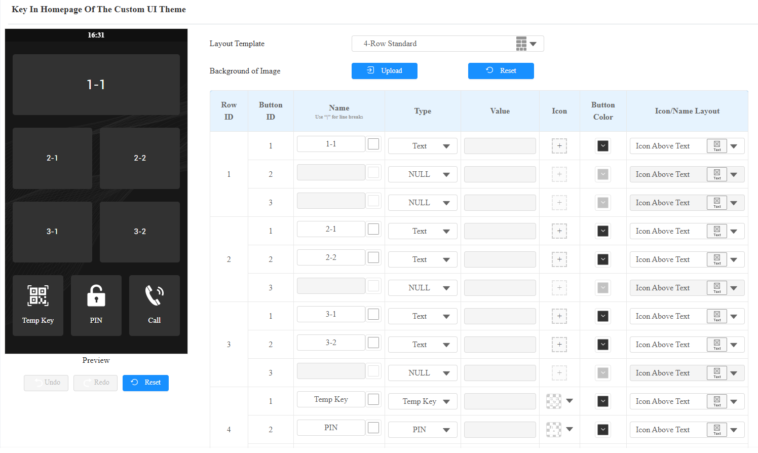
Layout Template: Select the homepage layout structure for the theme. A preview thumbnail is displayed for each template option.
4-Row Standard
3-Row Hybrid (with Large Key)
2-Row Hybrid (with Large Key)
2-Row Dual Large Keys
Single Large Key
Background of Image: Upload a custom background image for the homepage. Format: JPG/PNG; Maximum size: 2 MB. The recommended resolution is 720x1280.
Name: Define the text label displayed on the button. Maximum 63 bytes (supports all languages and special characters). Use "|" for line breaks in the button text.
Text Color: Click the color palette icon (next to the input field) to customize text color.
Type: Define the button function.
Text: Display-only button with no interactive function.
NULL: Hide the button.
Temp Key: Temp PIN input and QR code scanning entry.
PIN: The PIN input entry.
Call: Initiate calls.
Speed Dial: Quick-dial to preconfigured contacts.
API: Send an HTTP API request.
Value: Configure it when API is selected. Enter the API URL(maximum 255 bytes).
Icon: Upload and manage the button icon.
Add Icon:
Click + to upload an icon.
Supported formats: .jpg, .png.
Manage Existing Icon (
 ):
):Edit: Modify or replace the icon.
Reset: Restore default icon or clear custom icon.
Hide/Show: Toggle icon visibility.
Delete: Remove the icon.
Button Color: Customize the background color of the button. The color block shows the current color.
Icon/Name Layout: Configure the arrangement of icon and text on the button.
Icon Above Text: Icon positioned above text (vertical layout).
Icon Left of Text: Icon positioned to the left of text.
Icon Right of Text: Icon positioned to the right of text.
Preview (Left Side): Real-time visual preview of the custom homepage. Undo and Redo buttons are inactive (grayed out) until configuration changes are made.
Undo: Revert the last change.
Redo: Reapply reverted changes.
Reset: Restore default settings for the selected template.
Open Door Text Prompt Display
You can enable the open door text prompt for both door-opening success and failure. And you can also make the door phone display the user information when users use credentials such as RF cards for access.
To set it up, navigate to the Access Control > Relay > Door Setting General interface.

Display User Info: Display the user information after facial recognition and card swiping. For example, if facial recognition succeeds, the text prompt “Access Granted” with the user ID and name will pop up on the device screen. If it fails, the text prompt “Access Denied” with “Stranger, Name: Unknown” will be displayed.
Unlock Options Display
Users can select the door to be opened when the device is connected to more than one door lock.
Click here to view the feature details.
To display the unlock options, go to Access Control > Relay > Unlock Options interface.

Dial Key Order
The device provides normal and scrambled keypad display options. Opting for the scrambled setting means that the arrangement of keys is randomized each time, enhancing security by preventing password spying.
Set it up on the Device > LCD > Keypad Display Mode Of PIN Interface.
